Can it
2020 has been a big year for beverages, with beer fridges across the country being overrun with yet another addition to the canned RTD space each week.
Other than promising all the buzz with little-to-no calories, natural additives, double the fun and the chance to save the world while you drink, the resurgence of the can is a response to a number of trends in the global beverage space.
Having worked on a number of exciting can projects over the year, we’re fully onboard with the trend. Compact, convenient and with enough real estate to get truly creative with packaging, we thought we’d breakdown how and why the can has made a comeback, and our take on how to cut through with something special.
A Can-Do Attitude
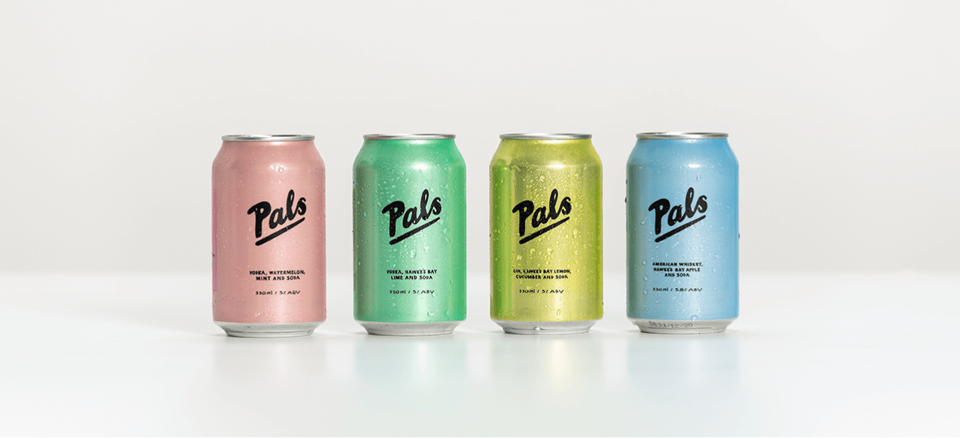
New Zealanders have never been averse to the humble can, but this trend has begun to take off globally. According to IWSR, “Low calorie and low ABV offerings, a focus on natural ingredients, the rise of the canned format, ever more sophisticated flavours, and Instagram-friendly brand identities have helped RTDs not only fit into consumers’ ever more health-focused lifestyles, but in many cases, made them aspirational too.” Brands like White Claw have taken the USA by storm and locally, players like Sundown Gin, Pals and Part Time Rangers are offering their ranges in exciting, youthful packages.
In addition to the generational shift, the recent Coronavirus pandemic has seen a natural shift in on-premise to off-premise consumption across the globe. ISWR similarly sees RTDs continuing to fare well through the global pandemic, with this continuing once restrictions are lifted and the on-the-go format RTD’s offer is favoured by those thirsty for adventure.
Format
One of the most desirable things about the can is the format it provides. Impervious to light, sealed tight and able to cool more quickly, the can is great at preserving its contents in a way bottles can’t. This makes them perfect for consumption while on the go, as well as their ergonomic design and ability to be disposed of simply. Part of this is what makes the can so appealing amongst the millennial age demographic who are consuming beverages at parties, festivals and while out and about.
Brands entering the space need to then cater to this favoured attribute, by adopting personalities and brand identities that celebrate these traits.
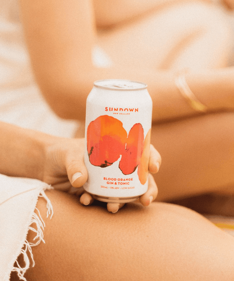
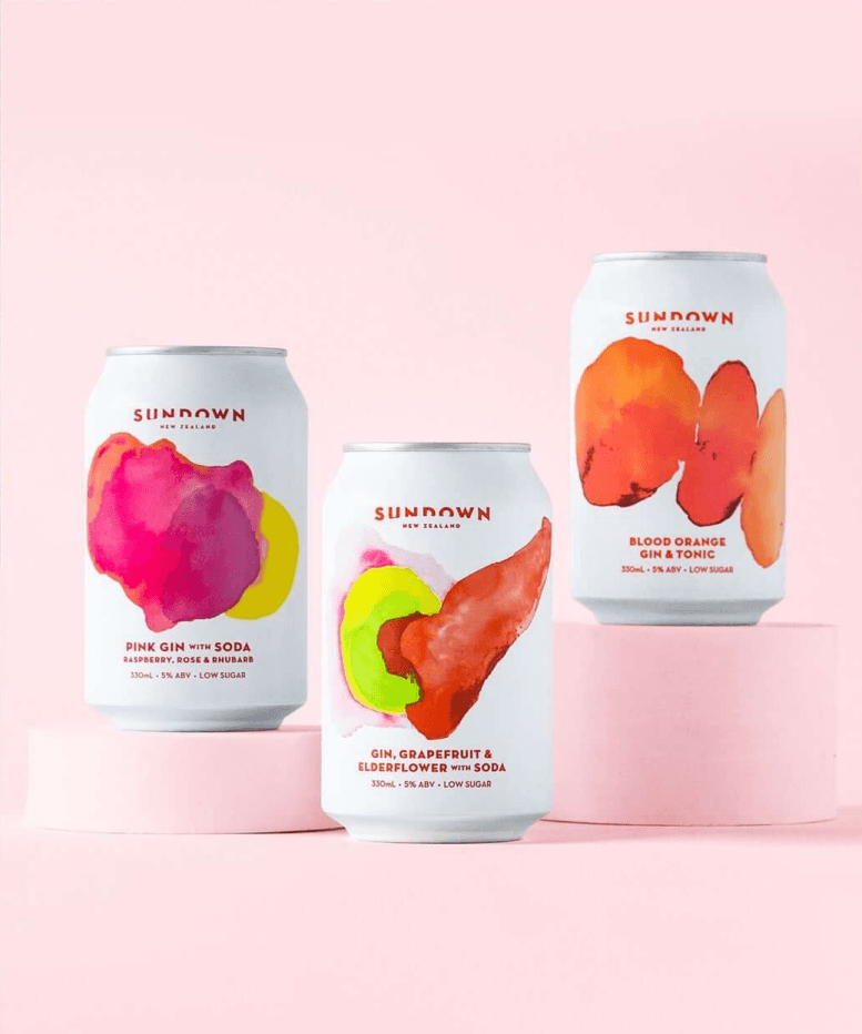
This was exactly the thinking behind our work for Sundown Gin, who sought to disrupt the traditional gin space with a fun-loving brand identity and RTD crafted for celebration. With our brand personality characterised as a lovable free-spirit, our designs were based on maximising colour and contrast, with Sundown now available in both can and bottle.
Our designs aimed to hero the natural ingredients and ‘light’ nature of the drink, so every iteration used bright tones, with green to evoke a feeling of spring/summer and natural abundance.
Contents
Beyond the physical shape, the can itself lends itself to getting creative with the contents. Custom carbonation means various levels of fizz can be added to any beverage, with canned and sparkling wine varieties also gaining popularity.
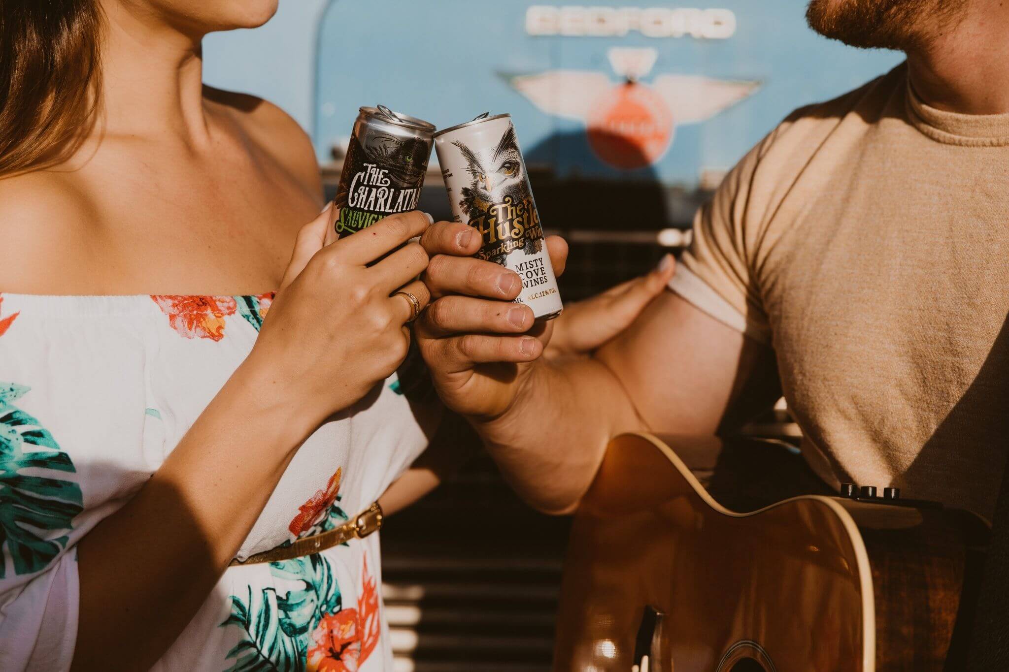
We helped our long-term partner Misty Cove join the party, to become the first NZ winery to put wine in a can - with eye-catching can designs and brand characters rolled out for the launch of their own line of canned New Zealand wine.
Misty’s ‘lovable rogue’ brand personality guided our design process, with our illustrations aiming to disrupt the typical ‘wine label’ style and capture the fun energy of a wine for good times.
This parallels global trends with sangria, spritzers, seltzers, sodas and other concoctions beginning with S making their way onto shelves and into chillers throughout NZ and the world. Beverage Canner, Nathan Ofstad attributes this to the creative potential carbonation has to change the palatability and mouth feel, making canned options new and exciting as well as convenient. Pair this with disruptive, engaging packaging and you have a winning formula.
Packaging
While the rapid growth of the category is promising, there’s a flipside. Competition is in abundance and with each newcomer to the space, it gets harder to stand out. This is part of the challenge and indeed the battle, as with close to 80% of consumers not knowing what they are going to buy when they enter the liquor store, standing out can make all the difference.
Because of the current novelty of cans, they’re also great for delivering twists on ‘classics’ or stirring up a tired category.
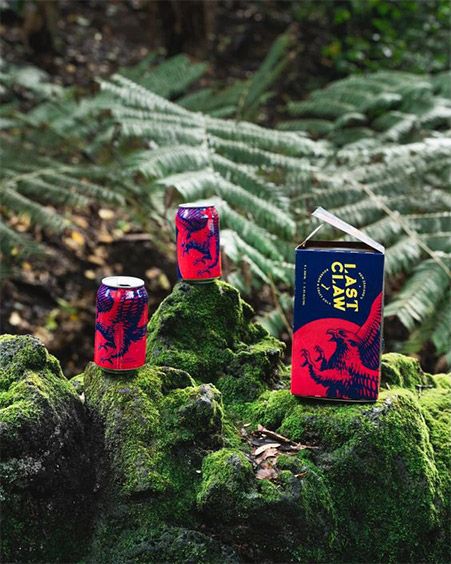
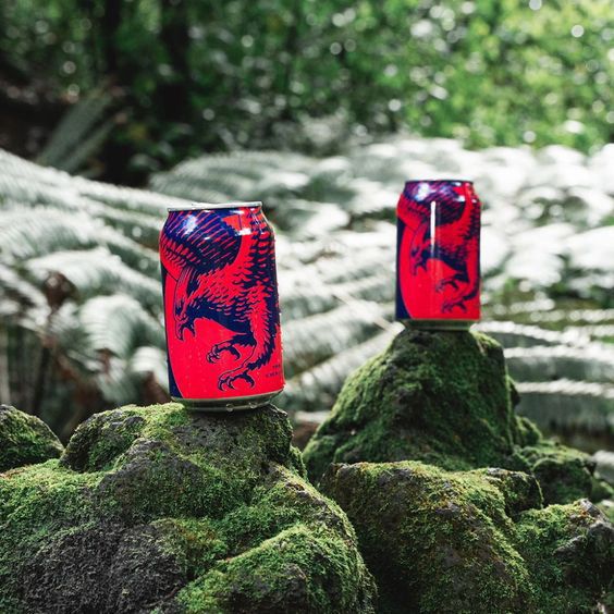
While the white-spirit space is bursting with colour and innovation, the dark spirits space has still been… in the dark. Dominated by hyper-masculine, sugar-laden bourbon and whisky options, we recently added a much-needed touch of colour to the space with Last Claw Bourbon.
Last Claw combines premium bourbon with a craft New Zealand cola and unlike competitors in the space, is a brand that relishes in it’s exception. Against a sea of black and gold, we added some overdue vibrance, with a bright red and blue colour palette and bold illustrations standing out against our provided competitive backdrop.
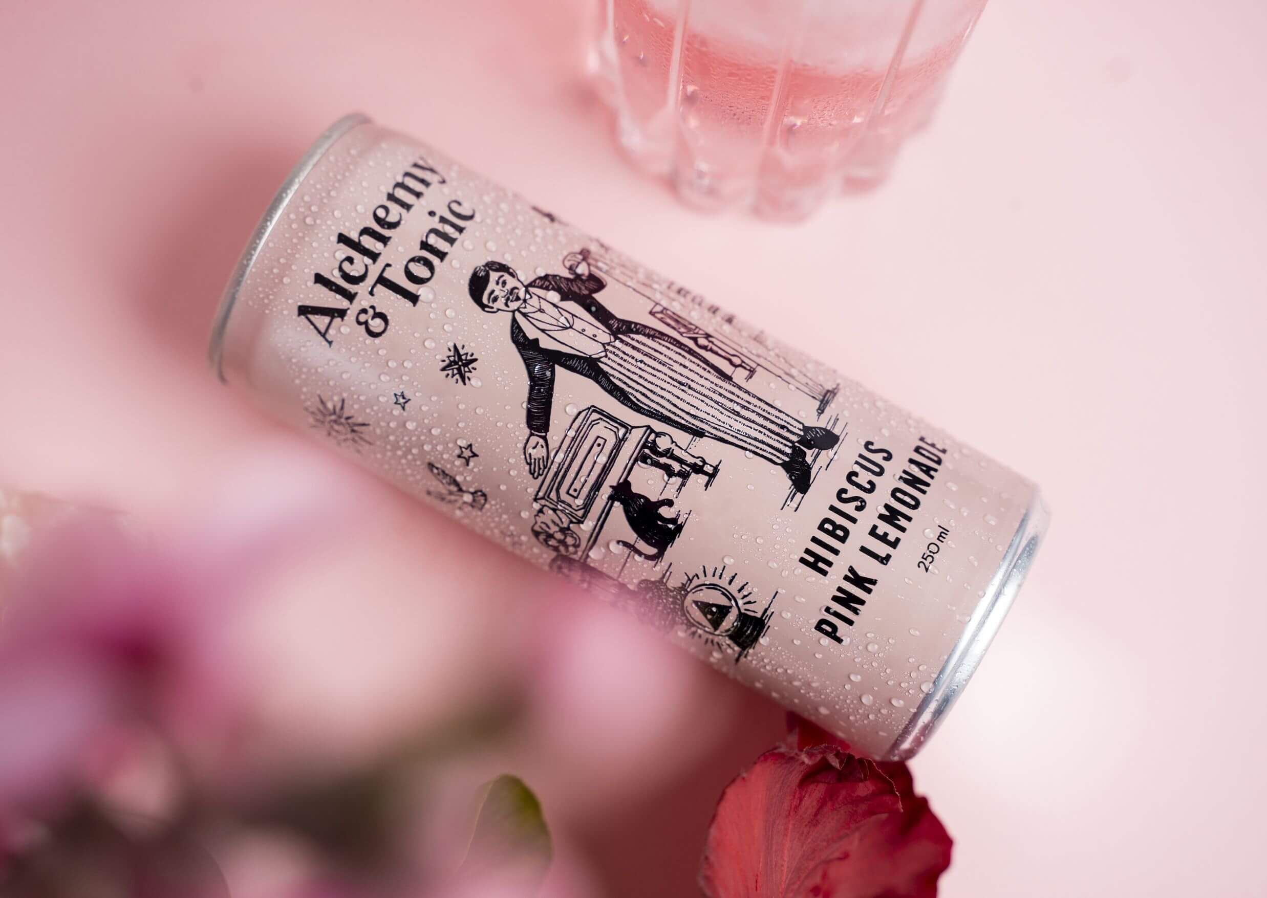
In the mixer space, we’ve used an illustrative style to bring brands like Alchemy & Tonic to market, capturing unique scenes that add a dash of vibrance to the drinking experience.
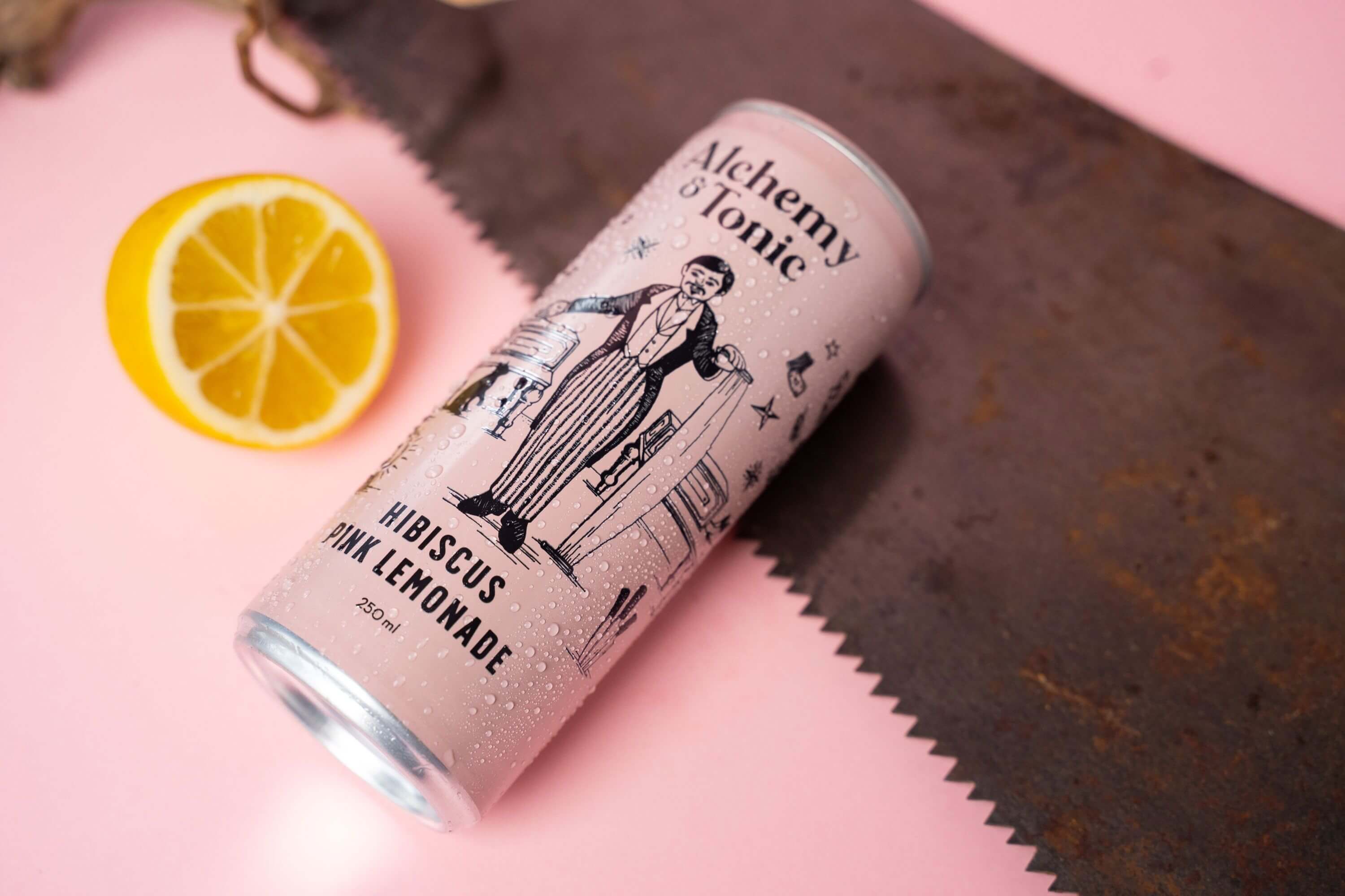
Ultimately, the idea is to capture the imagination. In the RTD space, where history and tasting notes are less at the forefront, the vessel is as much a part of the consumption experience as the drink itself.
They’re enjoyed out and about, on the go and with friends, so what you drink and why, says as much about you as what you’re wearing. This is why we’re seeing lifestyle-brands dominate, whether they’re about social responsibility, culture and charity - a natural response to our hyper-connected and always-on-line social landscape that sees fleeting moments of revelry live on in immortality in the digital space. Put simply, people care more and each moment of consumption, whether alcoholic in nature, or anything else for that matter, is an opportunity to curate and align yourself with brands that are trendy, new and exciting, or who deliver something deeper than the product itself.
In summary, there’s a lot more to the humble can than meets the eye. The category is increasingly premiumising with craft twists being added to once-simple spirit-mixer combos and exciting new flavours.
They’re also increasingly promising a more lifestyle-conscious option, with health and wellness factored in to lower calorie/carb options and a more responsible approach to drinking being championed - something we think is long overdue
While the drink innovation is key, visual brand identity is arguably as, if not more important. While we do see genuine flavour innovations or those that are first to market, they’re quickly met with copycats, offering a similar option in different packaging. The key here, as with any packaging and visual brand identity is to consider the brand essence, the customer and the shelf space, creating something bold, powerful and guaranteed to catch the eye.
Let's talk about what's next.
Get in touch to chat about your ideas, work with us or simply introduce yourself.VIEW MORE IDEAS
VIEW MORE IDEAS
VIEW MORE IDEAS
VIEW MORE IDEAS
